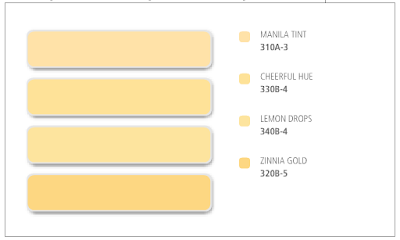
This is the part of choosing paint colors that makes Paul say “I KNOW WHAT! LET’S JUST USE THAT LILAC COLOR YOU LIKED!”:

But they are all so very DIFFERENT
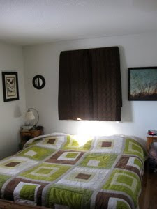
(Here’s the quilt I’d love to have work with the walls; good idea, Rah!)

This is the part of choosing paint colors that makes Paul say “I KNOW WHAT! LET’S JUST USE THAT LILAC COLOR YOU LIKED!”:

But they are all so very DIFFERENT
(Here’s the quilt I’d love to have work with the walls; good idea, Rah!)

Oh, but we need SO MUCH MORE information to help you pick. I mean, if that’s what you want. I picked a color so close to that “zinnia gold” for our third floor a couple years ago but against the horrible orange carpet it ended up looking like “flesh”. Then when we replaced the carpet with a nice beige and I chose a nice barely-off-white color for the walls it ended up being yellow, especially in sunlight. I’m terrible at judging paint chips.
I would say with wood floors and/or trim in a room that gets a reasonable amount of light I like Cheerful Hue the best…although it might just be because it’s called Cheerful Hue. I have a bad habit of choosing colors for their names and not because they are really what I want.
Cheerful Hue. Because Cheerfulness is guaranteed right in the title.
I’m with Paul. We painted our staircase walls a colour similar to those and it all went horribly wrong. I have to go up and down the stairs with my eyes closed. It’s not good.
You were intending to make this an internet referendum, right? :)
From my screen’s display, Manila Tint is my 1st choice, with Zinnia Gold second (you’re less afraid of bright colors than I am.)
If commiseration is what you’re after, I got blank stares when I asked the partner to pick a favorite from a set of 2×2 swatches on the wall. He couldn’t tell the difference between most of them, whereas some of the colors were making me feel visceral anger at their wrongness. (Sadly, none felt viscerally right, but I don’t hate the color we ended up with, so yay.)
So are you giving up on the quilt? Or what?
oh girl. yellow is SO hard!!!
you really have to paint a patch and see how the light and other things in the room play off of it. there is no getting around it. pick 2, paint a good sized square in the space and on two walls with different lighting is best. live with them for a week.
yellow is just a very moody color that will pick up a lot of other things.
I have a collection of hundreds of paint dealies like that from the days where me and my insomnia obsessed over colors and the Behr.com website for HOURS and days!
I lean toward manilla. I think because it has less orange in it.
may the force be with you.
-K
I’m a convert of the paint sample on the wall in different spots for a while. It amazes me how colors look different in different lights. In fact my bedroom is gorgeous in some lights and not so great in others. Wish I’d done a swatch. On the other hand, did the little boys’ room in Behr’s Premium Plus Ultra Pale Honey. Looks yellow in some light, beige-ish in others. SUCH a nice color. Highly recommend.
mmmhh, lemon drops!
I had the BEST yellow paint in my old house. Martha St*wart 8191 Gaslight. To myself, I always called it “Buttery Shortbread” because it was exactly that color; a little more cooked at night, and a little lighter in the daytime.
Bibliomama- No, no, it’s not that he doesn’t like the colors, it’s that he hates dithering between colors that are almost imperceptibly different shades of the same color!
Slim- Not giving up PER SE, but I’m finding that EVERYTHING looks awful with that quilt! The warm light yellows seem like they MIGHT work.
when I painted our living room, I went through 13 paint swatches on the wall. It looked like abstract art. And every single time I walked in the house with more samples my husband would say “but those look identical to the last 4 you put up.” But they were DIFFERENT. No really THEY WERE (she says, trying to convince herself.)
I’m voting for Cheerful. Because it’s cheerful :-) Manila seems a bit fleshy.
Am I the only one here that likes Lemon Drop.
Swistle- my husband is the same way. That is why I paint when he is out of town.
Cheerful Hue! Lemon Drops is runner-up
Lemon drop! Lemon drop! Definately paint a swatch. My mom painted the outside of her brand new house tan. The only problem was that when the whole has was done and dry it was more pink than tan. Definately a cautionary tale.
I think Cheerful Hue. But it’s hard to tell without a whole lot more context. The 1st and 3rd options just seem too pink and the last might be deep enough to be disturbingly orange without being a nice orange. Orange is actually one of my favourite colours.
When we moved into our current home it had been painted in a deep almond or straw or deep tawny colour that I would never in a million years have picked out from a swatch but it’s really nice. Deep enough not to be a boring off-white or plain enough to be beige but still very neutral and rich enough to be cozy.
In fact, you know how light-switch plate covers come in white or beigy/almond whatever? It’s that exact colour. The switch plate covers just blend in. Like I said, I’d never have picked it but all over the walls it looks really great.
We have a lot of avocado and plum accents (like your quilt, if I’m reading the old picture correctly) and this almondy switch plate colour works really complements them well. I think the ones you posted might be a little too orange.
I dunno, on my computer screen, these all look like shades of skin!
I like lemon drop.
Manila looks like skin to me. *jibblie*
My bedroom is a very similar colour (with a chilli terracotta wall). Which of those shades my bedroom is, I couldnt tell you…which is just to say it probably doesnt matter between the first three shades, but I think the last one is a bit dark?
All I can think is “Band-Aid” when I look at these. (I make my best friend choose my paint colors for me. I recommend that solution.)
Zinnia Gold…but these all look fleshy on my screen too. I’d have to pick two and paint swatches to see.
I’m afraid I’m in the “These look too fleshy” camp, too. I’d go with a golden color than has more brown in it. Not a boring tan. A golden tan – we have it all over our house and it looks great with everything, I kid you not. And I’m a girl who loves color!
I wish I could remember what brand of paint I went with, but I chose a warm pale yellow called Popcorn or Buttered Popcorn. It really worked with my dark furniture and warmed up the room.
This is exactly something that would happen at my house. I’d be all, “But I can’t DECIDE” and the husband would be all, “But they’re all the SAME”.
Usually I end up asking and getting his opinion and then go on and pick whichever I like (after days of mind changing). It’s a hard, long process but I never regret the end result.
I tend to agree with the other commenters thought…you should totally take samples and paint squares in various places all over the room and then chew on it for a few days. It definitely helps to get a realistic visual.
I also totally thought these were band aides. Im sure its just the computer. well,I hope. But all in all I like cheerful hue.
I am going to be NO help, because I do not like yellow AT ALL, not even to paint on my walls.
BUT, I will say, judging from your other painted rooms, that you should go with the deepest color. It seems to me you like “deep.” So…from these, I would go with the darkest.
But maybe, as a few other commenters expressed, you want something more golden? Golden brown? I dunno. These look too yellow to me (see above.)
GOOD LUCK!
I think Cheerful Hue is enough yellow to not appear fleshy, if you get plenty of light.
But really, no matter what you choose, paint while he’s not looking. That’s how I get away with most of my projects. I painted a tiny hallway purple while he was watching golf for several hours. He liked it once it was done, but having that man pick a paint swatch out of my purple options would have been disaster, i.e. Purple is not his favorite color. But it looks fabulous and he agrees. Men can’t see the potential. So just paint and then ask questions!
So some of you think they’re TOO YELLOW and others think NOT YELLOW ENOUGH. Fine help you are! (Also, I’ll bet a lot of the bandaid thing is the shape of the color samples.)
OK, well, if you want to make the quilt work, I would say Lemon Drops, because according to my monitor that’s the closest to the kind of grayish tan that I think might make it work.
I don’t see why we can’t all come to your house for coffee and cookies and staring at paint samples up on the wall. I can’t work under these conditions!
Have you seen Sherwin Williams Blonde? That looks like it’s in the same range, but having used it personally I can attest to the cheeriness and prettiness in ALL lights. It’s my #1 favorite EVER.
I like Lemon Drops the best, followed closely by Cheerful Hue.
Swistle,
You are so right, the shape of the graphics does contribute to the “band-aid” look. I really wish I had a better computer screen because I don’t think the colors are showing true on my screen. I think I like lemon drop the best but that could be because I really like the name. The zinnia gold has a nice rich warmth to it that I don’t get from the others. Based on the photos you’ve shown thus far, you have done an excellent job of picking out colors for your home so I’m sure you’ll do well with this choice. I will agree with the previous commenters that suggested you try and get samples to paint swatches in the room and see how the actually look on the wall. A friend of mine did this and at first I thought it was a bit of overkill but when I stopped by and saw the different “patches” of color, it all made sense. They really did look very different on the walls and it then was much clearer what shade was the best. s well.
Can you post the quilt pix alongside the paint chips?
Also, did you know you can get a tiny little can/bottle of a color (or colors) and actually paint a 10inch or so square on the wall first, to check it out? It’s a little added expense, but so worth it!
I am no help because in our relationship, I am the Paul. My husband comes from a very arty family (both my MIL and SIL make a very good living making and selling their art) so he has a very good eye for color and composition and all of that. I come from a family of accountants and find making those kinds of paint and color decisions akin to a sharp stick in the eye. I think I’d rather go to the dentist than fuss with paint color. So, all of those colors look fine to me ;-)
I want to say Lemon Drops but then I recall my own experience/love with yellow and lighter is always better. I had to repaint a room because the yellow became traffic sign yellow even though the test square looked fine. Which all of your yellows look really nice neutral yellows but I am now cautioned for too much yellow so I’d go with the first one.
I agree with Slim. Some sort of road trip to your house seems to be in order. However.. I LOVE yellow rooms and am weirdly delighted that you’ve picked one of myu favorite colors. Is so weird, these internet relationships Eh ?
I like no 4 becos it is the most yellow. you can even go MORE yellow and I shall support you !!
I agree with Kim way up there. YELLOW IS SO HARD. It took me three houses to finally get my yellow right. But now that I have it right, I love it. It all depends on carpet, trim and all that other stuff. I think you’ve got the right family here – warm yellows are my favorite. Good luck. I currently have four shades of greyish-blue painted in squares in my living room… when will I decide?
Lemon drops!
Unfortunately, boys just don’t see the differences like we do. Good luck!!
I’d be afraid of the first one, it looks like it might end up that old Crayola “flesh” color. My bedroom is very similar to the zinnia gold, and I love it.
I think maybe more of a yellowish-tan…more tan than yellow, but with the yellow tinge…would work really well with the quilt.
Look at the bottom row here. We used Behr paint but the Home Depot guys matched our kitchen to a Martha color and it turned out awesome. I think the Bamboo would look AWESOME.
Okay, having the quilt w/ the colors helped. Rather than gold, I would go with a more army khaki tone. Take at look at these Behr Colors and see what you think: HC114 Saybrook Sage (my fave), HC119 Kittery Green, 481 Dill Weed, 478 Sweet Caroline, or if you really do want something more light, SW 6423 Ryegrass. Any of them would be stunning with your quilt! and I so, so <3 that quilt!
I like Cheerful Hue and Lemon Drops.
I might be suckered in by happy names, though.
Kinda hard to tell on my screen. Like the Zinnia looks kind of muddy in a Dijon Mustardy way on my screen. Eck.
Those colors are too orange cream – I’d go with a green shade.
Like this one: Benjamin Moore – Rosemary Sprig http://www.housepaintingtutorials.com/green-accent-wall-in-my-hallway.html
I am voting for Dill Weed for the name alone.
Go to GardenWeb
http://ths.gardenweb.com/forums/load/decor/gal111751313100.html
look for Lewiville [sic] Green
I am probably being led astray by the quilt, but I worry that you are bringing too many colors into the room if you don’t pull a paint color in from one of the colors in your quilt. When we hired an actual designer, she used a dominant color, a secondary color, and then pops of a third color.
You’ve already got green, gray, and brown/tan. I can see adding some lavender accents, but not a whole wallful of something else.
On the right side of the quilt in the picture there are two large green squares with smaller squares inside them; could you use the lighter color that is making the smaller squares in the green squares?
Oh, this made me laugh:) For my vote, I like Cheerful Hue. Probably the best thing to do is see if you can get small samples of the paint and paint a small swatch of each on the wall. When we redid our downstairs guest room, I had it in my head that I wanted a sort of antique brick color for the walls. Poor hubby painted that room 4 TIMES before we hit the right color (I thought he would kill me, but each color came out too pink-y, so at least he was on board hating it too). They looked FERCECT in the color chips, but awful on the wall. Good luck:)