Last night I woke up at 3:00 and sleep didn’t come back. And why—WHY—would my self thwart myself like that? Sleep is good! Sleep is nice! Four in the morning is not a time to be sitting in a recliner with a cat and a book, however pleasant a way that might be to spend the time during the day.
Anyway. Coffee.
I’m reading a book right now that I’ll officially recommend to you if it finishes as well as it has begun and middled: The Good Psychologist by Noam Shpancer. I am mesmerized, MESMERIZED. I just love it and love it. Not only am I enjoying the plot, I’m finding the content literally therapeutic. Like, I am LEARNING PSYCHOLOGICAL TRUTHS and HAVING PSYCHOLOGICAL INSIGHTS. Or rather, being led like a willing and placid lambie to those truths and insights. You could read this book as therapy, is what I’m saying, and yet it’s entertaining and it’s fiction, not textbooky.
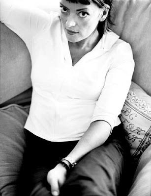
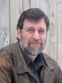
Plus, the author photo is pleasing to look at. I like a good author photo. Things that can make an author photo NOT a good author photo include but are not limited to: author putting her hands unnaturally at her face to hide a double chin; author using her upper arms to make her boobs look bigger; author looking like she had the photo taken at Glamor Shots; author perceptibly airbrushed. (I read mostly female authors. For men the pitfall list is less defined, and goes something like “Looking like a jerk.”)
Good author photos are harder to make lists about. The EFFECT of a good author photo is that I feel like I know and recognize and like the author, and I want to keep looking at him or her periodically as I’m reading. The photo should coordinate with the style of the book. I shouldn’t feel as if the author is trying to show us his/her most flattering angle, even if he or she IS in fact doing so.
One of my favorite author photos is this one from Suzanne Finnamore’s book The Zygote Chronicles (I’ve deliberately linked to the unavailable hardcover rather than to the available paperback, because book cover art is IMPORTANT and the hardcover captures the book whereas the paperback does not), taken by Kate Powers:

And another good one is Noam Shpancer’s, taken by Mia Lewis:

The more of the book I read, the more I like the photo, which is another sign of a good author photo.
Follow-up: I REALLY liked the book. I officially recommend.

I also have strong feelings about author photos in that I avoid them until I’m done with the book. Especially books that I love, and if it’s a new author to me, I find that knowing what the author looks like influences my reading experience, more often in a negative way. I keep envisioning the author as the storyteller or I get distracted imagining the author sitting at his/her desk, writing the book. Once I accidentally saw the photo when I had just started a new book and I couldn’t read it any more. God, I am weird. I do read a lot of Stephen King though, and if anyone’s appearance exactly matched their profession, it’s that guy.
I must admit the only author photo I can recall having any kind of reaction to is Shel Silverstein’s angry author photo on the back of his kids books. Talk about cognitive disconnect!
I work part-time at a library, checking books back in, and I am fascinated by the photos of authors on the back of books. Granted, some are older books and the pic is obviously dated, but many of them are just plain weird. Men try to look all steely and tough, but end up looking like a serial killer. I see many author photos of all genres, and more often than not, I’ll think: Really? The author CHOSE this picture for the back of their book? This was the BEST one? Wow.
I second the Shel Silverstein comment. With the shadows and downward glance, Holy Foreboding, Batman. Geez.
I’m like Denese, I don’t usually look at the picture first. I like the author to be faceless I guess. I like to think I am reading about something that really happened, rather than a story someone is telling me.
Love that picture of Noam Shpancer. He looks so Psychology Professorial. You’ve made the book sound super intriguing. Since I’ve got about 5 books going at a time (check out my summer reading list still in progress),
http://twinmommusings.blogspot.com/2010_05_01_archive.html
I’ll have to put this one into the mix too. Sorry about the insomnia.
Shel Silverstein’s photos ARE so scary! My son got “The Giving Tree” and we flipped it over after reading it and I just about screamed. My son just stared, and said “what’s that??”
Those are great photos. If I were ever published (fat effin’ chance on that one), it seems very good to be photographed from above, especially because my face? Totally not petite, like the rest of me.
I like Noam’s leather jacket and the strange wooden wall he’s standing in front of. He seems like the kind of guy you’d want on your time.
That’s funny, how you “like” the book more, if you can connect with the author.
I have a love- hate affair with the photos. As if a pretty Indian woman may be assumed to not be a good writer, and a creepy looking guy should make good horror stuff… and that old guy with the beard and glasses certainly must know his history.. but her? She’s so young and looks so rich? I don’t even want to pick up her book.. and I KNOW she’ll get tons of TV interviews and mag layouts.
sigh…
I just read this book based on your recommendation and must confess that I was totally mystified by the ending. Or lack thereof, in my opinion. What did you think of it???
Elizabeth- Oh! I don’t remember being mystified! But it’s been a month, and I find my memory wipes books after about a week!