One thing I’m doing recently is finding ways to make “five children” seem Right and Complete. I look at this year’s Christmas picture and admire the way five children space out so nicely with two adults (big kid, adult with little kid on lap, little kid, adult with little kid on lap, big kid). I consider our car, which I love, and which seats seven. I consider the fundraising brick I filled out, which had enough room for seven names but not for eight.
My friend The New Girl recently sent me a giftie of a very pretty journal for writing wallowing thoughts in. With it she sent a notecard, and the notecard had a picture on it of four eggs in a nest. Which gave me the idea of looking for a picture with FIVE eggs.
I documented my search in today’s Milk and Cookies post. (And by the way, if you have us in a feed reader, you may have noticed that it’s not working anymore. That got knocked out of kilter by the site upgrade, so you have to resubscribe to the feed.)
What was I saying? Oh, yes, so I did find a picture of five eggs in a nest, and I’m going to buy it, and furthermore I’m going to have it matted and framed at the same time, because if I don’t, I know perfectly well the print will sit in its cardboard-lined envelope for YEARS while I don’t take it to the frame store.
So I thought I’d just, you know, pick the frame I liked best. AHA HA HA HA HA HA HA! You know what happens when you start playing around with mats and frames? You create a bizillion wonderful options, and you can’t choose one and let the others go. Observe:
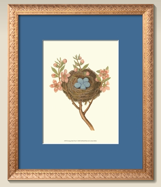
A
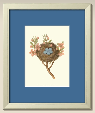
B
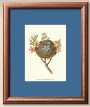
C
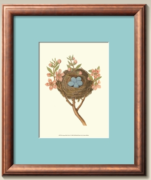
D
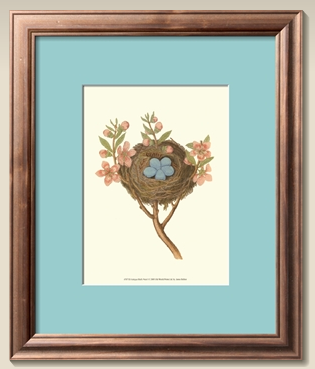
E
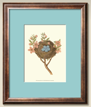
F
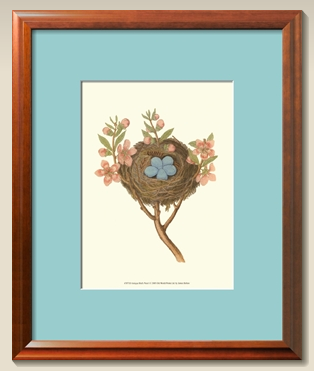
G
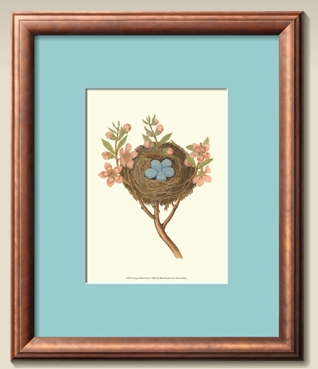
H
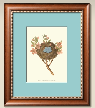
I
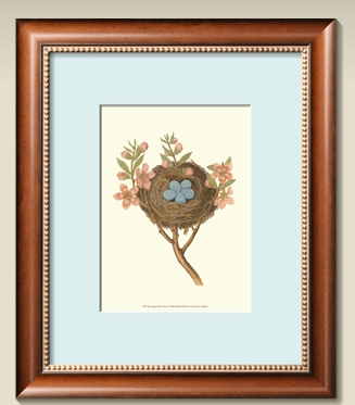
J
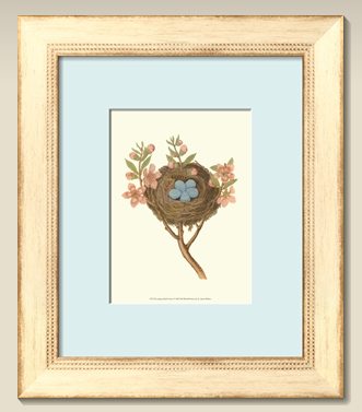
K
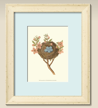
L
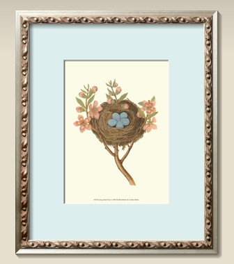
M
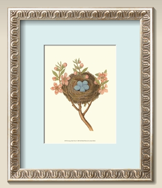
N
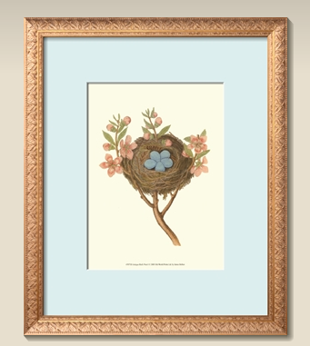
O
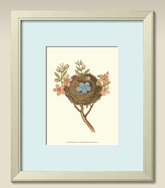
P
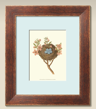
Q
Light blue mat? Medium blue mat? Darker blue mat? Gold frame? Silver frame? Light green frame? White frame? Brown frame? Brownish-gold frame? Plainish frame? Ornate frame? AAAAAAAAAAAAAAAAAAAAAAAAAAAAAAAA!!!
Poor Kara Marie, who is not only an artist but an artist who has worked in a framing shop, offered to help me. Can you imagine the regret she must be feeling right about now? So I thought I’d call in reinforcements for her. HELP.
I can tell you a couple of things:
1. The most important thing to me is the eggs. I want the eye drawn to the eggs.
2. That’s all I got!

Have to say I like E, L & Q. But that’s just me.
I would go with the lightest mat. The other colors draw your eye to the mat, rather than the photo. I would go with M or N, because I like silver. Also, silver goes really well with light blue and also doesn’t overwhelm the picture. I think N is probably my favorite.
I like L; I’d like to see what it looks like with the darker blue mat. I also like Q. I like the distressed-looking frames apparently. Depending on the color and type of the furniture in the room where you are hanging the picture, I’d go with L or Q.
K is also nice. I missed that on my first look.
D and I are my favorites. The mat matches the eggs so it makes them pop, and the frame color is a nice complement without pulling away the attention from the eggs.
I thought the dark blue mat made the eggs look washed out, while the pale blue mat made the eggs practically disappear.
I like the light blue mat, which makes the slightly darker eggs pop. I like the look of the light, whiter frames, however, I would pick a dark frame because I know you have white walls. White frame on a white wall doesn’t appeal to me.
K…definitely…the light colored frame really made the eggs pop out to me. It was instant while scrolling…I was all..”blue mat…blue mat, light blue mat..EGGS!!”, seriously. And I like that one because the mat is lighter…aaaannnddd…oh, because its a little ornate on the inside edging but distressed too.
Really..I love this one, but I would proabably stand it on wood furniture rather than hang it on a white (or light) colored wall. Wouldn’t want that frame to get lost to the eye, either.
I like B
I like N the best! I can’t really expound on that, it is just the one I like. :)
I like A or I.
THAT’S why I couldn’t get to your M&C post this morning! Thank you.
I like a light frame and a light mat, esp. if it’s going to be on a wall that’s a different color from the mat and frame.
i think the lightest mat definitely wins out in egg-poppage. i dislike the teal blue mat.. i think it’s too “matchy” with the eggs and thus they sort of blend into the mat as opposed to stand out as the centerpiece.
i love the 5 egg idea SO MUCH, though :-)
I’m a fan of B or L. And it’s a lovely picture for your perfect nest of 5.
I think that Q’s frame with A’s mat would REALLY pop. Something about Q’s frame brings out the texture in the nest and eggs. And as with eye makeup, if you want the blue eye to pop you have to line with much darker blue shadow.
You can’t go wrong with any of these options. I like K and L the best because they keep your focus on the eggs.
I love this idea.
At first I was put off by the darker mat, but I do believe that it is the one that draws me most to the eggs which was your #1 (only 1?!). So, I’d suggest A or C. Love the print, BTW.
I think it also depends on the wall color of where you’re going to hang it… I love L, but wouldn’t love it as much necessarily on a white wall, you know?
I think Q is my all around, any wall anywhere favorite. I think color and the texture really help direct your attention to the nest because they are so similar.
I vote for I!
I like L & P. Definitely use the lighter mat – the darker one detracts from the eggs.
I agree with the people who said they like the lighter mat. But I personally like J a lot. Although if you are going to put it on a white wall that might not work so well (like Hillary said). But on a colored wall, it would look awesome!
C. The correct answer is C.
Definitely the lightest mat! It brings the eye to the eggs right away. As for the frame, it would depend entirely on the decor of the room where you will hang it, but I like the weathered white ones or the silver frames the best (K, L, M, or N). If I had to choose, I’d choose K.
I like these:
B, because the white frame sort of disappears, while the blue mat draws attentions to the eggs.
K, because the ivory frame and blue mat draw my eyes to the eggs in the center.
Q, because I just like the general look of it.
If it were me having to make this decision, I would first decide which color of matting I like the best with the picture, and then choose a frame that looks best with the picture and matting. You know, narrow it down to making one decision at a time, instead of the whole shebang with twenty thousand options all at once. (Isn’t that how it feels? So many choices! So many options! AAAAHH!)
I like B the best.
I have a coworker that has a necklace that is a nest with 3 eggs in it (she has 3 kids). You might like that as well.
L. ELLLLLLLLLL! L! L! L!
(I think I might be overselling a little.)
(L!)
I agree that the darker mats say, “MAT! THIS IS A BRIGHT MAT!” but the lighter one says, “Eggs! Look at these pretty eggs!” And the frame in L has a homey feeling to it that adds character but doesn’t distract from the eggs.
I like B and L best.
L
I like the darkest mat but don’t know how it would look with L.
I did it this way: I scrolled through quickly and noted which one drew my eyes to the eggs the most. It was B. For me, anyway.
Also, the Milk and Cookies feed worked for me today. Huh.
Dark blue mat makes me look for the other blue thing… which is the EGGS!
B.
My vote is for B — I like the way it looks more than the others, and I do think that it draws the most attention to the eggs.
Oh, I SO have a thing for nests. Hence the cards. And I LOOOOVE that print. LOVE. IT. (It’s so much better without the hysterical-slash-really-horrible sixth little egg on the countah.)
Anyway.
I like a LOT of those frames. Any of them, really, except the really, really light ones I like. However, I do have a distinct preference for the lightest mat. I think that the other two compete with the nest.
xo
F
I immediately liked B.
But then you made it hard, because the list became NEVER-ENDING! lol.
I definitely liked every one that had the white frames. I think the white frame compliments the quaint picture very well. Too ornate, and the picture is lost amongst the frame.
Unlike others, I actually found that the eggs popped out to me more with the darker matting (like, B). As I scrolled up through the list after scrolling down first, I felt like the eggs became clearer to me as the mat got darker. In general, the photo in the centre of this all stands out more with a darker matting framing it. With the lighter colours, I feel it gets lost and doesn’t “pop” in the middle of the frame as much.
But I will say this: J through to the end is “Swistle blue”. It blends completely with your blog. LOL.
But I still like B best.
I like B, with L a close second.
K or P. The light frame and mat make the eggs pop much more than with the darker frames/mats.
Not sure about the frame, but the medium blue matte almost matches the eggs, which really makes them stand out.
D, E, F, or H. Yeah, I’m no help. But I love that Swistle Blue mat!
I like B and L the best. They are the ones that pulled my eye to the eggs. In fact, I wasn’t sure I liked the picture at all until I saw those. Now I really do. And the symbolism of the 5 eggs is really sweet.
I love K! And L. And Q. But I definitely like the lightest mat the best!
My pick is C. The blue really compliments the eggs and the copper picks up the flowers, all of which draws your eye to the center.
B gets my vote.
I like C and L. For almost opposite reasons, they both bring out the eggs most to my eye. I definitely prefer the simpler and more natural-wood-looking frames.
Oh, and if it helps, I’ve always thought five was an ideal number of children.
I really like Q because it draws my attention to the nest. Good luck deciding! I always just go with what looks good enough and go!
C, a thousand times C! The darker blue with the dark frame takes your eye right to the eggs.
Well, that’s only 17 options. I’m sure you can find a wall big enough to fit a full set of 17 prints…or you could rotate them…sorry
In all seriousness, I love the light blue mat with the light frame…so I’d go with K, L or N. But I’m also wondering how much this is influenced by the background colour on your site. You should change the site to the same colour as your walls…then we can really decide.
I vote for P – lightest frame + lightest mat = eye drawn to the egggs, as they become the darkest color in the picture!
I like C or K.
Since the picture is so pale, I think the darker blue mat looks the best and draws the eye. Such a cute little picture by the way!!
M is the one that popped out to me as I scrolled through the choices. I think the frame draws your eye in to the center and the mat color does not distract.
They all look nice. It really depends on the decor of the room you are putting it in. I personally like L best.
Definitely B. Although if we are being completely honest even though I’d already decided on a definite option I would still play around with all three mats just to confirm it.
K or O —
Very pretty print!!
I am enjoying Postcrossing, which I started because you’ve mentioned it a few times. Lots of ppl in Finland looking for contact with the outside world! I’ve send 6 postcards and 4 have been to Fins.
I like B or N.
I didn’t read the comments so I wouldn’t be biased with other people’s better taste.
#1. I am not usually sappy, but oh man, the nest with five eggs. That is really, really cool. I love it. LOVE it.
#2. I am partial to white frames, and the ones that are kind of “aged” looking seems to feel right with that picture. I like a mat that pops, so you immediately look to the center to the same color. So with all that said, I would totally go with L as a frame, with maybe a bit more vibrant of a mat…even though the soft blue is pretty.
E
For me, the nest and eggs seem to pop more when there is a darker frame, so I’m voting for C, F & I.
K
The background and frame are light enough to complement each other and the eggs without being too stark for yoru eyes. It’s very soft and comforting to me, like an old country kitchen.
I choose K or L. Or maybe the middle-hued mat with either of these frames. Y’know, just to add a few choices.
K & L–I love the lighter blue and the light frames (and country style) seem to go with the rustic look of the bird nest. Or I just like that style :)
I like L or Q. Those are the two that my eyes go directly to the eggs.
I also like the mat on L.
K. Definitely the lighter blue mat. I like the frame on K because it pulls in the color of the petals on the flowers.
B, E, I, J, P and Q
I like the last mat color, but would prefer something that more closely matches the color of the eggs.
As far as the fram is concerned, I like to coordinate all the frames in the room I’m going to hang the picture in, so would need to know where this will be hung and any nearby art work to truly get a good one.
If hung alone, I would pick J, but that’s because I totally have a similar frame in my house and clearly it’s my style to begin with.
Based on your main spec (making the eggs the focal point), I liked K best. Option A reminded me pleasantly of your British china set–although I couldn’t tell you why.
I’m responsible for the darker mat, it’s true! I admit it. And it is because, on my monitor, the lighter mat has an aqua cast to it, the teensiest teensiest tint of green. But not the same green as the leaves. So I look at the lighter mat and wonder if, in person, it’s an almost-match but not quite, because the eggs look blue-blue cool blue to me. Almost matches make me uncomfortable. Maybe in person it matches, maybe not. Only my monitor knows the real truth. But! I stand by C. :)
I don’t know a lot about framing but I would double-mat it with the larger mat just a slightly warm white and the inner mat, which you’ll only see a thin strip of, a light blue to match the eggs. And I really like frame M – it looks like it matches the colour of the nest really nicely. I think if you just use a large blue mat, your eye goes to the mat, not the eggs. And I think the pale frames let your eye wander away from the picture to the wall. Good luck!
Still K even with the different colored “walls”!
C for me.
Whoa, lady, you called in too many reinforcements! Bet you made a bar chart to figure out choices! Have full sympathy for your dilemma, and also for the surfeit of choices – which do not point to any consensus, but since you asked, and I love this cute pic, I’d say K or L if you want to keep the light mat. These would go well on an otherwise empty wall which would emphasize the painting. But if there are other things around, or it is not well lit, the frame from the last with the dark blue mat will focus things nicely. Plus it’ll go with cream walls.
J. J. JJJJJJJ!
The beaded rim echoes the eggs or something, so it draws your eye in. Or my eye, anyway.
this changes everything
Q
N
M
KKKK
I like the silver frames with the light blue mats the best, but I think that the white frames with the light blue mats draw the most attention to the eggs, because that way the eggs are the darkest thing in the picture. So K and L draw the most attention to the eggs; I personally prefer M and N.
I like Q, I and C. In that order. Just in case you were wondering where I stood on the issue.
I like B and L the best. I thought that the darker frames tended to draw my eyes away from the eggs, but those two definitely highlighted the picture itself for me. But maybe they are too light for the wall then? I dunno.
Hmmm. L & P. That’s my vote.
Haven’t read the other comments, but I like option C. The darker mat makes the eggs “pop”, and the darker frame is a nice compliment to the branch color, and also a nice contrast to your wall color.
I or K
K, L or P. For definite sure.
OK, I’m probably going to be difficult, but I seriously have a thing for color. If you’ll match the color of the mat to the color of the nest, and then use a natural looking frame, the blue of the eggs will pop because it will be the ONLY blue. I think the blue of the mat is competing with the blue of the eggs.
I like the frame on K, but with a brownish mat.
Nice print!
I like D, I, K, and L.
i think that the darker mat actually makes the eggs pop more. the other lighter ones seem to compete with the color of the eggs, instead of enhancing.
bottom line? i like B.
I say B or N or P. Anything brown draws attention away from the print. The softness of white or cream or silver beautifully frame it.
Oh, if we’re talking cream walls, I say silver… with the lightest mat. By far the most attractive mat colour and compliments the eggs SO well.
kinda like j myself.
love the nest/egg idea! maybe i should find a picture of a nest with two eggs in it.
I say frame J with the dark blue mat. I like the beading around the picture, and personally I think the dark blue make the eggs show up better. Good luck, they are all beautiful.
I can’t even decide what clothes to wear in the morning; I will be of no help to you.
(My word verification is “vista”, like it’s MOCKING my new Macbook.)
K! I think white frames, or almost white frames, show off the actual picture beautifully. K is my favorite of those colors….
I like L the best :)
Hmmmmmm, I think I like Q the best now! With the cream colored “walls”.
I am curious what the mid-level blue mat would look like with a white frame though…
I like J, K, and L the most.
J and Q are my favorites.
K!
I like C and J and M. But that was just a quick scroll through, which is less thought that I’m sure you have given this.
I just think it’s a LOVELY idea. Five little eggs. Your babies. What a good mama bird you are. ;0)
I love the simpleness of B – your eye goes right to the eggs and doesn’t get distracted by the frame, yet it is still a pretty frame. Good luck! What a great idea.
A and L.
I think.
I can’t be sure though, seeings as how my brain exploded from weighing all the possibilities.
L
k, definitely k. cute idea by the by.
P.
I like A.
The one that draws my eye to the eggs the most is F- something about how the dark frame surrounds them. But I also really like N.
Btw, I think this is a really great idea. And a very productive way to help you deal. Way to wallow!
I seem to be in the minority here, but I LOVE the darkest blue with that print. The others just look like they aren’t quite the right shade and I find that distracting. I think I’d like the dark blue even better with one of the silverish frames, like N. If I had to choose from one already composed, I’d pick C, for sure.
I hope I’m not too late- but I like J or K- please don’t go with brown wood, ok?
L and M are the two that had me looking at the eggs–that could change though depending on what color wall you put it on. Cream frame on cream wall may not be the best option…I’m just sayin’.
Now I like A & C. Now I think that the white frames might blend with the wall. Hrm.
But I still prefer the dark blue matting for sure. Makes the entire centre picture stand out more than the other colours do.
I’ll make one choice, and say C.
I chose before I read the comments…wow! “N” is my choice but I like Kelsey’s idea of the darker mat with the frame in “N”.
Definitely L.
I thought Q & F were pretty cool.
Dark wood looks more “vintage” to me, whereas silver/white/distressed ivory looks more “country,” so I guess it kinda depends on what look you’re going for.
That’s all I’ve got.
Definitely N for the frame; the scrollies mimic the lines in the nest. But I like the dark blue mat the best.
I like frame E but with the light mat. I think the med and dark blues are too much. I like the frame L, but with the cream walls, I don’t think it works as well.
I would have said A or C, but after reading a bunch of the comments, now I don’t know!
M
K for me
Choose L or I’ll unsubscribe. Kidding, Swis, but I do love L.
K. I would want K in my house. So pretty!
Oh so many choices! But I really like K the best.
G
I love G!!!!!
Mat D, Frame A
I really thought B made the eggs stick out, color-wise.
Medium or dark blue mat (leaning to medium). AND for the frame? I like almost all of them. And apparently you do, too. While it’s hard to choose just one because you like lots, once it’s in your house, you’ll like it still and that’s all that matters. I’d go for the cheapest frame of the ones you like ;) They’ll all be fine.
My personal favorite is E. However, I think K draws the eye to the eggs best.
*This time posted on correct post. WINK.*
K,L, M, P all draw my eye to the eggs because the frames are all light/thin enough that it causes your eye to just ZOOM right to them without getting sort of hung up.slowed down by the outside.
I fI had to pick one (which YOU DO), I would go with K. Rustic and charming but yet sort of polished. And it was the one that I thought let the eggs stand out most.
I can’t wait to go back and read what other people say – I LOVE all things home decor related!! …and I love Marshalls!
And…I would totally leave it in the box for years unframed, too.
A! I like think it looks best with the eggs. What a cute idea!
Easier is what I don’t like – I don’t care for the dark blue mat or the dark wooden frames – they just seem too harsh for the delicate nest and eggs. I like the silvery frames the best, with either medium or light mats. Love the print all around!
I like A the best. N second. Some of the others seem to washed-out pale.
I gotta give some love to F. I really think the frame plus the mat makes the center of the picture pop out.
i know i’m late here, but B,G,L, and P are my favorites