You have seen the bad, now it is time to vote on five that didn’t come out so bad. I’ve invested as much tooth enamel as I’m willing to, so there won’t be any more sessions and these are the final five options:
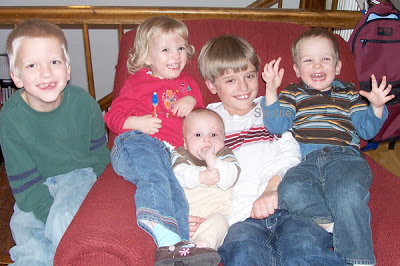
Option One
(l to r: William, Elizabeth, Henry, Rob, Edward)
The good:
- Great of William, great of Rob.
- Fine of Elizabeth and Edward.
- Acceptable of Henry.
- The older four all look happy.
The bad:
- Only one child is looking at the camera.
- It’s hard to see in a smallish photo, but Elizabeth looks strained because she’s laughing with her teeth clenched.
- Also, Elizabeth is holding a marker.
- It’s acceptable of Henry, but it would be nice for it to be GREAT of Henry, since this is his first Christmas card photo.
- Edward has his hand in his mouth, and he’s squinting.
- I didn’t dress them specially for the picture, so they’re just in whatever they happened to be wearing.
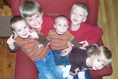
Option Two
(l to r: Edward, Rob, Henry, William, Elizabeth)
The good:
- I like the arrangement and think it’s interesting to look at.
- It’s fine of Edward, Rob, and Elizabeth.
- It’s cute of Henry.
- Everyone’s looking at the camera.
- They’re wearing clothes I deliberately selected.
The bad:
- The clothes I deliberately selected don’t work. The red shirts blend into the chair. The orange shirts match in a jarring way: “Why do these two children match?” The brown dress is a different shade of brown than the brown in the shirts.
- It’s bad of William.
- Edward’s hand is in his mouth and he’s pointing.
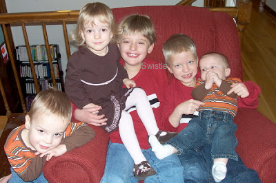
Option Three
(l to r: Edward, Elizabeth, Rob, William, Henry)
The good:
- The arrangement is a little jumbled, but I find it pleasing to look at.
- It’s great of Edward and Rob.
- It’s good of Elizabeth.
- It’s acceptable of William.
- Everyone but Henry is looking at the camera.
The bad:
- The clothes still don’t work.
- Henry is posed weirdly and has his hands in front of his face and his legs splayed out and his jeans are pulled up funny.
- William is poking Henry.
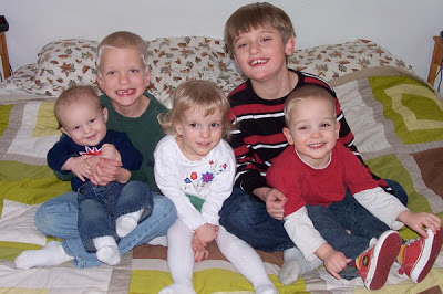
Option Four
(l to r: Henry, William, Elizabeth, Rob, Edward)
The good:
- I think this kind of arrangement works way better than the ones in the chair, where children were spilling out of the confines.
- I chose the clothes deliberately, and this time I think they work: not as matchy as I might like, but not clashing or drawing attention.
- It’s terrific of Henry.
- It’s very good of William, Elizabeth, and Edward.
- It’s acceptable of Rob.
- It’s cute to have the older boys holding the younger boys, and the Elizabeth on her own in the middle.
The bad:
- They are looking in three different directions.
- William’s smile is kind of forced.
- Rob looks kind of weird. And I like the older children to look as cute as possible, since younger children are pretty cute even if they’re not at their cutest.
- Elizabeth isn’t as cute as she could be, and last year she was the one who got sacrificed in a photo that was great of everyone else, so this year I’d like her to be really cute.
- It’s on our BED. Is that okay? To have OUR BED in the Christmas card photo?
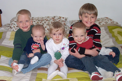
Option Five
(l to r: William, Henry, Elizabeth, Edward, Rob)
The good:
- It’s terrific of Henry and Edward, and Edward was SO DIFFICULT to get good pictures of. He kept ducking at the last second. At one point I gripped his upper arm in a manner not compatible with the spirit of Christmas.
- Pleasing symmetry: older boys tilted very slightly out, younger boys tilted in, girl perfectly straight in the middle.
- Elizabeth’s pose is typical of her, and it’s cute the way her toes are pointed in and her hands are folded. She’s not smiling, but I think her expression is cute anyway. So earnest.
- It’s good of William.
- Henry’s “NEW!” shirt is showing.
- William is holding Henry’s foot in a cute way.
- Rob and Edward look cuddly, and I like how Rob’s hands are positioned. He looks like such a big brother. You’d never guess that Edward kept slamming the back of his head into Rob’s chest and chin.
- EVERY SINGLE CHILD is looking at the camera. Isn’t that one of the signs of the apocalypse?
The bad:
- It’s not great of Rob. His teeth ARE prominent, but they’re not THAT prominent. And his smile isn’t characteristic. It’s not BAD of him, but it’s not as cute as he is. Compare to Option One, which is more typical of him.
- It is, as I say, on our bed. Which, meh?
I think there are two kinds of votes that are useful: own-conclusion votes, and reactive votes. So first I think you should choose your favorite, and vote for it without reading any comments. THEN, if you have sufficient time and interest, read the comments and see if it changes your opinion at all–and if it does, say so. My mom and I find that sometimes we each choose a favorite, but then when we hear the other person’s favorite we change our minds–or become stronger in our convictions.

I’m going to vote for option two- it’s the most interesting, in my opinion, and the kids all have pleasant, if not perfect, expressions. And I think the outfits look fine, not clashy.
Option 1 or Option 5. I think Option 5 is my favorite by a narrow margin.
I think option 2 is my favorite. The kids all look cute and happy, and I like the angle. When I did a quick scroll through before reading the entire post, that was the one that caught my eye.
Option 1 was my favourite.
I really like all the kids’ faces in Option 5, but I don’t like the bed in the shot.
I’d still pick Option 5…regardless of bed.
And it really doesn’t matter which you pick…you have a really cute little family. The imperfection in each picture give a little personality and an impression of the family…which is sweet.
[*studiously not reading any comments*]
I’m torn between the first one and the last one, both of which I love. I think the last one would be my favoritest favorite except that I can’t help but worry that Elizabeth is about to burst into tears (clearly from your comments, though, she isn’t). As to the bed question–really, it could be anyone’s bed. It could be the guest bed. It could be the futon couch folded down with an attractive quilt laid over it (wait, what–only I have entirely decorated my house in futon couches?). Unless you have a large number of Christmas card recipients who will recognize the bed immediately, I think the bed is okay. However, my sensibilities are not Delicate, so I am probably not a reliable judge here.
#5 !!!!!
I like 1 and 5. One seems happily chaotic, which is very cute. And everyone looks great in Five, and I like that Elizabeth’s expression is a little bit “See what I have to put up with? Boys!” Which is great.
I like option 1 best. Option 5 is a close second.
I feel the pain of the x-mas card pic. Ughh.
I like 1 the best. They just look really happy in that one.
I like the first one the best. It seems less “posed” and more “fun”.
Super cute!!!
Option 1 is my favorite. Everyone looks so happy, and…the bed sort of weirds me out. Sorry. SORRY!
Okay, but now that I’ve read the comments, I agree with Ami and I DO like Option 5 for that reason. Elizabeth is all, “These boys. I am weary, oh so WEARY”.
Option #5 is my favorite. Definitely. I don’t think it matters at all that the kids are sitting on your bed; I didn’t even think about that when looking at it. My focus was completely on the fact that ALL the kids looked great, for all the reasons you said, and that all those good points outweighed the minor bad points.
Option 1 is my favourite. They all look happy and giggly and natural.
Option 1 or option 5. I like option 1 a lot, because all 4 of the older kids look SUPER happy. However, in option 5, I love that Henry is all giant grin and “NEW!” tshirt – but, I think Elizabeth could come off as looking sad.
I really like either of them! (which, yes, I realize is SO not helpful)
First instinct is option 5. They all look cute. I’ll read the comments and check back.
Option 1. Without a doubt! It totally stands out to me as the best of the bunch by a landslide! I bet you will get all different opinions though. I don’t know the kids though, so I don’t know if it really “looks” like them or not! Any of them are darling and wonderful and you can’t go wrong!
And now that I’ve read through the comments, and I see the opinions of others re: picture #5 and Elizabeth’s expression, I totally agree. She does have a very cute “OMG THESE BOYS ARE MAKING ME CRAZY” sort of look going.
Before reading the other comments: Two and three are my favorite.
After reading the comments: I still like two and three the best.
No. 5 for sure. Elizabeth’s look seems to say “how did I get here with all these boys?!” So cute.
#3 is my fave, just because Edward is so cute!
#3 is my fave, just because Edward is so cute!
#3 is my fave, just because Edward is so cute!
I like option 1 and 2…i think the smiles are better in number 1, but I like the aerial view in number 2…I can’t decide.
I was going to say 4, but since everyone else seems to pick 5 over 4, I want to be part of the ‘in’ crowd. So my vote is for 5!
I like option 4 the best. I refuse to be influenced or intimidated by the other commenters. Thats my choice and I am sticking to it.
Ok, I am typing this on my own before I even go in to your comment section.
#1 is my favorite. Everyone looks great, and you’ll never notice Elizabeth’s clenched smile—it just looks big and a bit cheesy and so 2-year-old girl. Henry seems in his glory being surrounded by the big kids, and it seems like it is a personality trait of Edward’s to have his hand in his mouth.
I actually really like them all, even bed photos. (I find it weird that everyone is in socks except for Edward though)
You could also do a photo collage of all of them—and instead of writing “Merry Christmas, Love us” inside, just write “What? See how well YOU could do with 5 kids!!”
Finally, I think Rob has an adorable boyish grin. ADORABLE!
I really love seeing them all together. And I’m pretty sure the best Christmas photos are of kids being kids. GOOD LUCK!!
number 5. it’s win/win.
#5!!
Four definitely – everyone looks like they having fun even the baby! And it is just plain cute!
Four definitely – everyone looks like they having fun even the baby! And it is just plain cute!
Four definitely – everyone looks like they having fun even the baby! And it is just plain cute!
My 2 favorites are #2 and #5. I really like the pose of #2, but I really like the symmetry you mentioned in #5. I think all 5 kids look good in both – you are a miracle worker to get them looking at the camera!! AND smiling!!
I think I’d have to pick 2 UNLESS you can somehow blur the background of 5, so that the bed pillows are less noticeable.
Good job!
I like option 1 the best… the kids look really happy.
Option 1 — hands down. No contest.
Have you thought about turning any of the black and white? One of the you liked but said someones teeth were more prominent? B&W is ver forgiving. You may not even realize they are sitting on your bed. i like the angle of the one where they are all looking up.
I like Option 5 a lot. Option 4 is my second choice. Reading the comments made me think I should vote for Option 1, but I went back and looked at the photos again and I still stand by my original opinion.
I like #1 and I love #5. The look on Elizabeth’s face in #5 is just awesome…but I’d probably pick #1 because they all look so happy. I’m fond of group photos where the group isn’t necessarily looking at the camera.
Option 1. No question.
I vote for option one!
My runner up is option five and I really thought I might go with that one, but then I scrolled back up to Nr. 1 and they are just so darn HAPPY and adorable in that one. So nr. 1 is definitely my favorite.
I also dont think its bad if they arent looking into the camera, doesnt matter one bit.
And also also, kudos to your kids for tolerating all the picture taking! I still feel bad for my mom when I remember what a hard time we gave her when she tried to take a group picture of us at christmas and easter. We would never have sat for that many pictures. Granted, it was always RIGHT before we got to open presents or hunt for eggs, so we had better things to do than sit still for pictures, but without the incentive, she would have not had a chance at all (I guess this is why she never sent out Christmas pictures).
I think I like the last one. Teeth and all.
Option 2 is interesting, but my fave is option 5.
Number 1 was my immediate favorite. It looks spontaneous and happy.
You can’t go wrong on any of these pictures, though. Your children are beautiful!
Option 1, hands down. It’s just weird to have the picture taken from the bed.
well you know i like bed pics. number 5 was my fave before and after. doing it in black and white or sepia will camoflauge the bed especially after cropping for the card.
definitely number 5 for me! i am now DYING to read all the other comments. also, omg rob is SUCH A CUTE KID, and i swear on all that is holy that i mean that in a perfectly nice and not creepy way. i just think you’re going to have quite the lady killer on your hands shortly :-)
oh also, psh. bed. whatever. i think having the kids all looking at the camera far outweighs the location.
#5 hands down. I think the bed is cute–i like your bedspread
I like Option 1 best. Though I must say I am impressed with your ability to keep five kids ALL IN THE SAME FRAME, much less getting them all to do anything like sitting and smiling together!
Gerald and I both vote for Five.
Now I’m going to read the other comments…
Ok, I do agree that 1 is indeed Very Happy Looking, but I still like 5 the best.
I like #5….if the bed bothers you, maybe crop it out a little or get one of those picture holders that hide the edges? Sorry if anyone else suggested this, I didn’t have time to read through all the comments!
Shannon
Option one, no question. It looks natural and the kids don’t look as if they have been posing for an hour. ;o)
This might be a strange comment to un-lurk with, but so it happened.
I like choice 1, everyone looks happy and natural and I like that in a picture.
I like #2, because it says to me “hey, it would take an act of God to take a perfect picture of five children at the same time, so here are all of my children looking like we are having fun. Merry freaking Christmas, now where the hell is the brandy because do you have any idea how many pictures I had to take?”
And that’s just the kind of card I like to receive.
This is before I read any comments….I love Option 5…but I also really really like Option 2.
My own favorite is 3, with 5 as a runner up. I like 3 because of the “hodge podge” of hugs and they all seem to enjoy being in that chair together…and I like the “I’m a model…can I tell you something in confidence?” type pose that Edward is doing. I like number 5 if you’re going for traditional posing, but am sad because, even though Elizabeth is in the middle it just seems kind of like,”I have nobody to cuddle with”, more so than Edward hugging the chair. Does that make sense? I like the pictures with her “mixed in” in the chair. Although Henry’s smile in the last two could be sold on ebay, it’s that cute. And, on the bed issue, I didn’t realize it was a bed, until you mentioned it. Which means one of two things: I either don’t pay enough attention to pictures I’m looking at. or, it doesn’t matter that it’s a bed. And, by the looks of my comment length, I’d go with the latter.
I like option 5 the best, maybe you could photo shop out the bed and replace it with a nice winter scene.
Option 4! So cute.
The last one, definitely! The poses are great. The boys look incredibly cute and dear little Elizabeth’s expression is priceless. It’s like she’s thinking “oh dear, what have my parents gotten me into: the only girl, surrounded by all these silly boys?”
Option 5.
And if not, then 2.
I like number one. Everyone seems really happy and like they’re having fun. The bed kind of weirds me out, to be honest, although I have no idea why.
#3 for sure, they look the mosr natural and sweet. trust me, I’m do this for a living.
Option 4 sticks out for me. I love the arrangement and all the kids look very natural. Cute pics!
Option 1 or Option 5
Option 5 has the longest list of positives and I agree with them all. Option 1 everyone looks genuinely happy, not posed.
I vote Option 4, or Option 1.
Actually, I’d be happy with any of these if your were my relative and I got one in a Christmas card.
5
I say 5!
I liked option 2 the best, but then read your comments and switched slightly more in favor of my other favorite – option 5.
Jules
I’m going with my gut, without reading your own commentary. #1!
Now that I’ve read all the comments here, I don’t know how you’ll ever pick!
I like 1 and 5 the best. 5 probably the best of all. I don’t think it matters that it’s on your bed. Who cares? The kids look adorable, and that’s what matters.
#5 without a doubt. They all look gorgeous!! I think Rob and his cutie teeth are adorable. And the older boys holding the little ones? tooooooooooooooooooooooo cute. I love how Elizabeth is all, please, I am woman! Holla!
I think the bed is fine. There are five of them for cryin out loud… ya gotta use a big surface for all them to fit without being squished!
:)
I followed your directions without even reading the last paragraph (confession: I skim). Now that I’m REALLY looking. I’m also loving #5.
I think that the lucky part for you is this…you have got beautiful, beautiful children. Man they are cute. And surely everyone you send a card to knows that and will certainly know how cute the kids are regardless.
I vote option 3 or 5. I like 5 most except for the bed…but we’re looking at the kids not the bed…yeah, I like 5 best. Though option three is awful cute with the little guy leaning on the arm of the chair. Eh, I say you close your eyes and point to one of ’em. Good luck with that.
well, warning, photoshop-lover here, but I’d take #5, cut the group out and put them over some sort of cutesy background…
1 and 5 are my favorites. And I’m trying not to look but I already see lots of 5’s so I’m going to go with ultimate favorite as 5!
Option one or Option three…leaning more towards option three…Edward is too cute in that one!
Are you still looking for opinions? B/c I like 5. But really Swistle, they are all terrific, and everyone will be SO impressed with your madd mom skillz- getting 5 FIVE children to look cute in so many pictures- you DO have secret powers, don’t you?
Number FOUR! And for God’s sake stop torturing these kids with more photo sessions!
First time commenter here – I’d pick either option 1 or 5. It’s hard to choose between them. I think I like 5 best, but then I like 1 an awful lot too. I love in 5 how Elizabeth sort of looks like “Help me, all these boys are wearing me down!”
number 1 for sure! very cute~
I like option 5, even if it is on your bed. :)
I like the first one (Henry is EDIBLE in that picture) and the last one. I also like the one where they are all looking up. Some great caption about ‘Look out! Here comes Christmas’ or something wise-ass like that would MAKE it.
I don’t love the bed but think it would be less noticeable when the image is a card, if that makes sense. Plus, the kids are so very cute and the last one with them all facing front and the older boys holding the younger boys with the beautiful little earnest girl in the middle…I love, love, love that.
PS. Just to clarify: it’s not that I don’t LOVE the BED, because it looks really nice and comfy.
I just meant, like you said as a picture place.
But it’s fine, really.
And nice.
I like two and five. I think 5 barely edges 2 out.
Option 4- Because it is just plain cute- not too stiff, and very happy kiddos. The bed thing doesn’t bother me- it looks better than the chair pictures, actually, I think……You could do a “vignette” effect to blend out the background, maybe? I like it! Good luck- I haven’t even taken a picture for our card yet and I have ONE kid. I’m a real procrastinator. One year we turned them into “Happy New Year” cards.
I love Option 5, except Elizabeth looks like she’s going to cry. The boys holding each other are too precious though. Could you possibly Photoshop a smiley picture of Elizabeth’s face onto that photo? Is that acceptable? Photoshopping one’s child into a Christmas photo?
Without reading other comments first…I’m going with 5. I really like all of them though. Now, not to throw a monkey wrench in it but have you thought of doing a montage of more than 1 photo?
I am not swayed by reading the other comments. I do like the aerial view of #2 also and the comments reminded me of that. But I stand by #5. Such cute kids!
last one! the last one if my favorite!
Man, I really like #3, but I don’t see many other votes for it. I also really like #1.
All of them are cute, though, and I’d be pleased as punch to get any of those pictures in a Christmas letter.
Okay. It was really difficult not to read the other comments first, but the last photo (#5) was by far my favorite.
Going to read now.
Okay after reading the others I now still like number five, but feel like I was rude not to express in my earlier comment that you have beautiful children and excellent picture taking skills!
I thought that Option one was def. the cutest overall. The kids look like they are having fun in that moment.
I like option 5, I think. Having the bed in the background is a little strange, but all the kids are adorable, so you don’t really notice.
I do like the angle of #2, but after looking them all over I have to say, you weirded me out on the bed thing so, NUMBER 1!!!! Yup!
I have not read anyone else’s comments- yet. Option 1 and 5 are my favorite with 1 leading the way because:
-I don’t like them on your bed as much
-The kids are cuter overall, quick look in Option 1 and some people will only quick look not actually “see” each, ya know?
Maybe I’ll have a different opinion after reading a few other opinions.
I vote for the first!
Number 5, for sure!
Option 1, if you ever get this far in your comments. 96?!? Holy cow.
I like #5 and #2 best. Goodness, those are some cute kids!
Like you need one more comment! But my vote (and I followed instructions, haven’t read any comments yet) is for Number One. Their smiles are all genuine, and I don’t mind Eliz holding a marker. :)
I’m heartened that you’re sending a regular photo that you took – not a professional shot with everyone posed, or a well-lit (not that these are badly lit), artsy-fartsy photo that makes mine (all of us next to our tree, taken with the self-timer) look amateurish. I like regular photos.
I like 5. I agree that the kids first planned outfits blend into the chair. And I don’t think the bed is a bad thing at all. they’ll be looking at the kids.
Rob’s the oldest. He’s been in tons of cards. If his smile is the only thing sort-of wrong, go with it.
And I don’t know if you’re interested, but I can probably take the new off Henry’s shirt. Email me if you want me to try
#1 or #4.
One! One! They look happiest.
Option 1 is the best. It looks more natural, although I know it is unlikely all 5 kids would be sitting there at one time. It just looks like a snapshot of a day in the life and I think people will like that.
I did read some of your commentary, but it did not change my mind.
If you pick one of the bed shots, you can add borders if you order the pictures from Walgreens, shutterfly, etc.. that may take out some of it or at least make it less noticeable.
ON second evaluations, the looks/smiles on the second-to-last one are happier, though.
Option 2
Option 5 – definitely
i vote for number 4 or 5 probably 5 but something about 4 really stands out to me. henry is extra cute in 4
Voting with out looking at other’s opinions: OPTION 5 :o) It shows how brotherly they are with the holding of the foot and the embrace hold by Rob. Too bad Elizabeth isn’t smiling but Henry is just so darn cute here.
I think option 1. 5 is good though as well!
I like #5.
My initial reaction is that 5 is great. I love that all the kids are quite happy and looking at the camera.
Option 5, turn it into B&W and thus all concerns about the bed are eliminated. If you like someone’s head in a different pic you could try swapping it out if you know how. Lots of tutorials on the web.
The kids all look great!
#1, #1, #1!!!!
Or #5 if it’s black and white, I think the colors of the bed distract a bit from the kids, since it’s a different color than they are wearing….
Cute shots, ALL of them!!!
Option 5 is my favorite. It’s just too funny to have Ms. Girl surrounded by her entourage.
I like option 5 the best! They all look so sweet.
I’m new to your blog, please feel welcomed to come and visit mine.
Your family is beautiful.
Jillian
wow! Swistle’s mom commented!
before reading comments option 5
after reading, still option 5